
CSO Workplace Zones- A Demography of Daytime? (Part 1)
PART 1 - DATA PREP and EDA
Background
The Irish Central Statistics Office ae responsible for conducting a Census of Population every 5 years. They release several data products based on the Census, which to date has been primarily focussed on where people live (or more accurately, where they spent the night on the night of the enumeration).
They do however, collect a sizeable amount of information on where people spend their time during the day, which is published as a very detailed dataset called POWSCAR or “Place of Work, School or College - Census of Anonymised Records” link here. This dataset is aimed primarily at researchers and there are strict conditions attached to accessing the data.
The Workplace Zones dataset (link here) is somewhat of a compromise - it has been created with anonymity of the subject in mind, something that cannot be guaranteed in use of the POWSCAR data. The image below is a list of the reasons and conditions around creation of the workplace zones dataset.
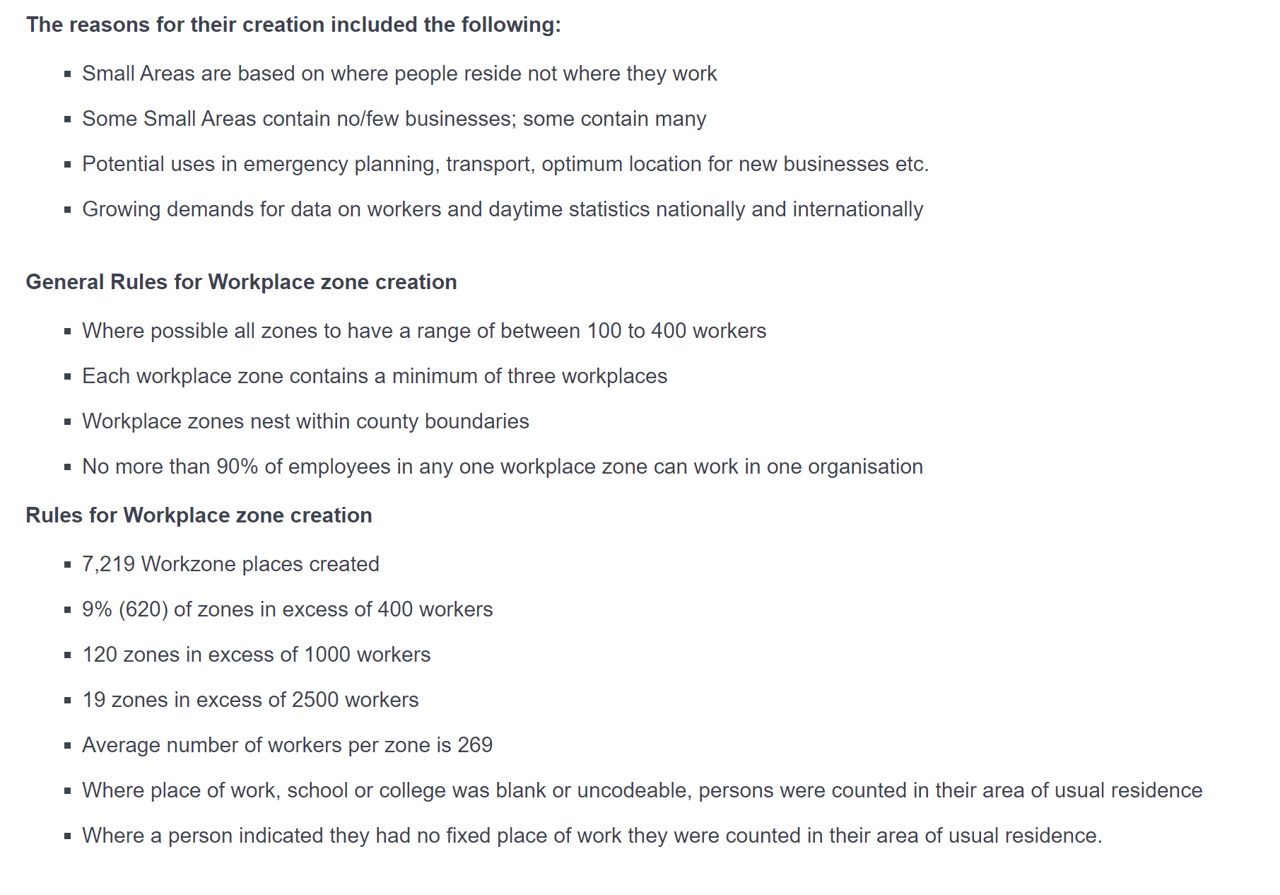
Workplace Zones Creation and Conditions
Analysis Rationale
This data is a very good complement to the Valuation Office dataset, which I have discussed in this blog post. It therefore makes sense to see if there are relationships between the datasets - perhaps it might be possible to predict the rateable valuation of property in a given Workplace Zone based on some predictors contained in the WZ dataset?
This will be a nice opportunity to explore the spatial analysis features within R, namely the excellent sf package. We will get to that properly, along with some machne kearning approaches in Part 2 of this post.
Step 1 - EDA of the Workplace Zones dataset
The data was munged to create proportions for the various categories, then principal component analysis was used to reduce dimensons. The dataset was then clustered to 9 clusters (choosing that number simply for visualisation aspect), and weights calculated for each predictoragainst the clusters. Below can be seen a map with the clusters, and a heatmap showing the weighting of the predictors vs the clusters. An interactive map is available at the embedded Tableau workbook below.

WZ Clusters

WZ Clusters - Detailed View of Dublin Area
The follwoing heatmap shows how the predictors map out over the clusters. Intensity of colur signifies magnitude, brown shades being negative and green being positive.

Heatmap of Predictor Weightings against Clusters
Links to Visualisation and Code
The github repo for this analysis can be found at https://github.com/mick-odonnell/wz_analysis
The interactive visualisation is available here: Tableau Workzone EDA

